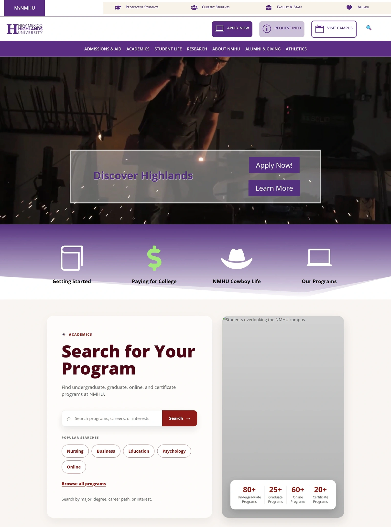
A multi-year overhaul of New Mexico Highlands University's primary web presence — rearchitecting navigation, rebuilding templates, and introducing modern content discovery tools for prospective students.
When I began the redesign, NMHU's website had a fundamental structural problem — almost every page lived at the top level of the URL hierarchy. There was no meaningful information architecture, no clear pathways for different audiences, and no way for prospective students to efficiently find programs that matched their interests.
The site was built to hold information, not to guide people through it. For a university whose digital presence is often the first impression a prospective student has, that wasn't good enough.
~80%
of pages at top-level URL
0
audience-based navigation paths before redesign
58+
undergraduate programs needing findable templates
The first major structural decision was rebuilding the global navigation around audiences and decisions rather than institutional departments. Prospective students don't think in org chart terms — they think in questions like "how do I apply?" or "what programs do you have?"
I introduced four primary audience pathways — Getting Started, Paying for College, NMHU Cowboy Life, and Our Programs — giving every visitor an immediate entry point matched to where they are in their decision process.
The global navigation was rebuilt from scratch to support this model, with a clear hierarchy that scales across department and program pages.
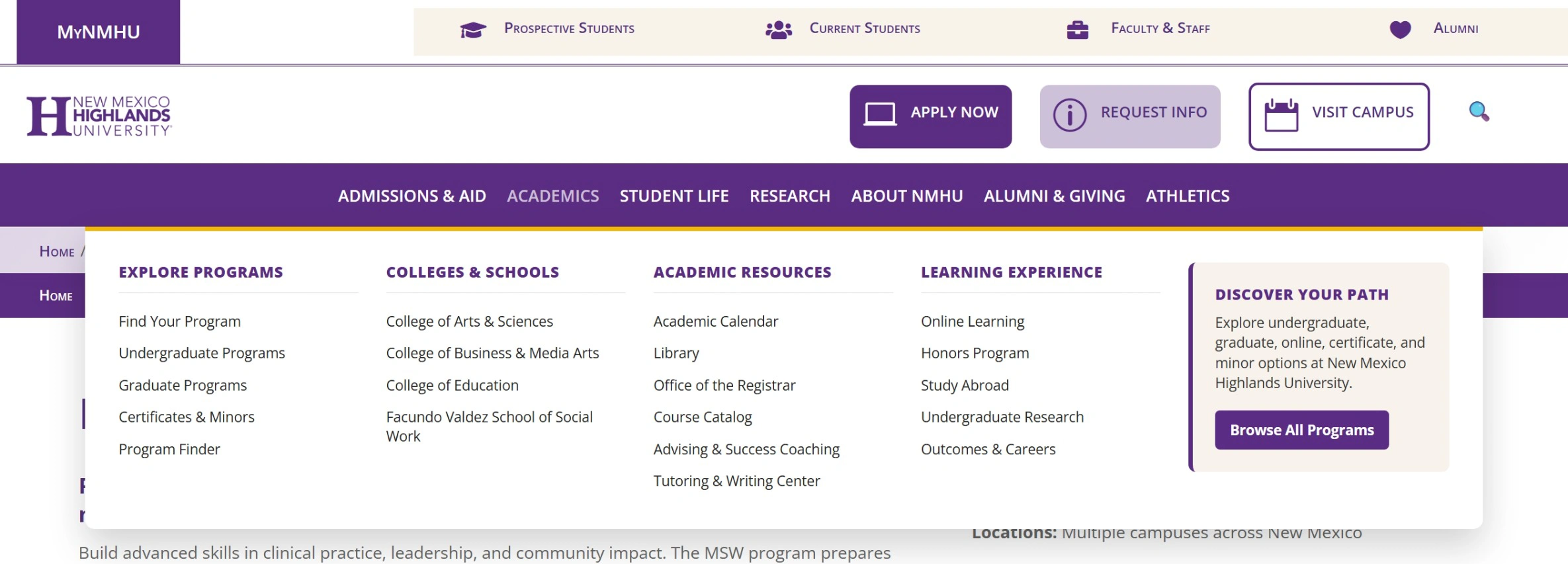
The new global navigation operates on two levels simultaneously. At the top, a utility bar routes four distinct audiences — Prospective Students, Current Students, Faculty & Staff, and Alumni — directly to their relevant content without requiring them to wade through the full site structure.
Below that, the main navigation opens into a full mega menu organized around how people actually think about academics — not by department name, but by purpose. Explore Programs, Colleges & Schools, Academic Resources, and Learning Experience each contain grouped, scannable links with a prominent Program Finder entry point.
A persistent "Discover Your Path" callout within the mega menu keeps the Program Finder accessible from anywhere in the academic navigation — reinforcing program discovery as a primary goal throughout the site.
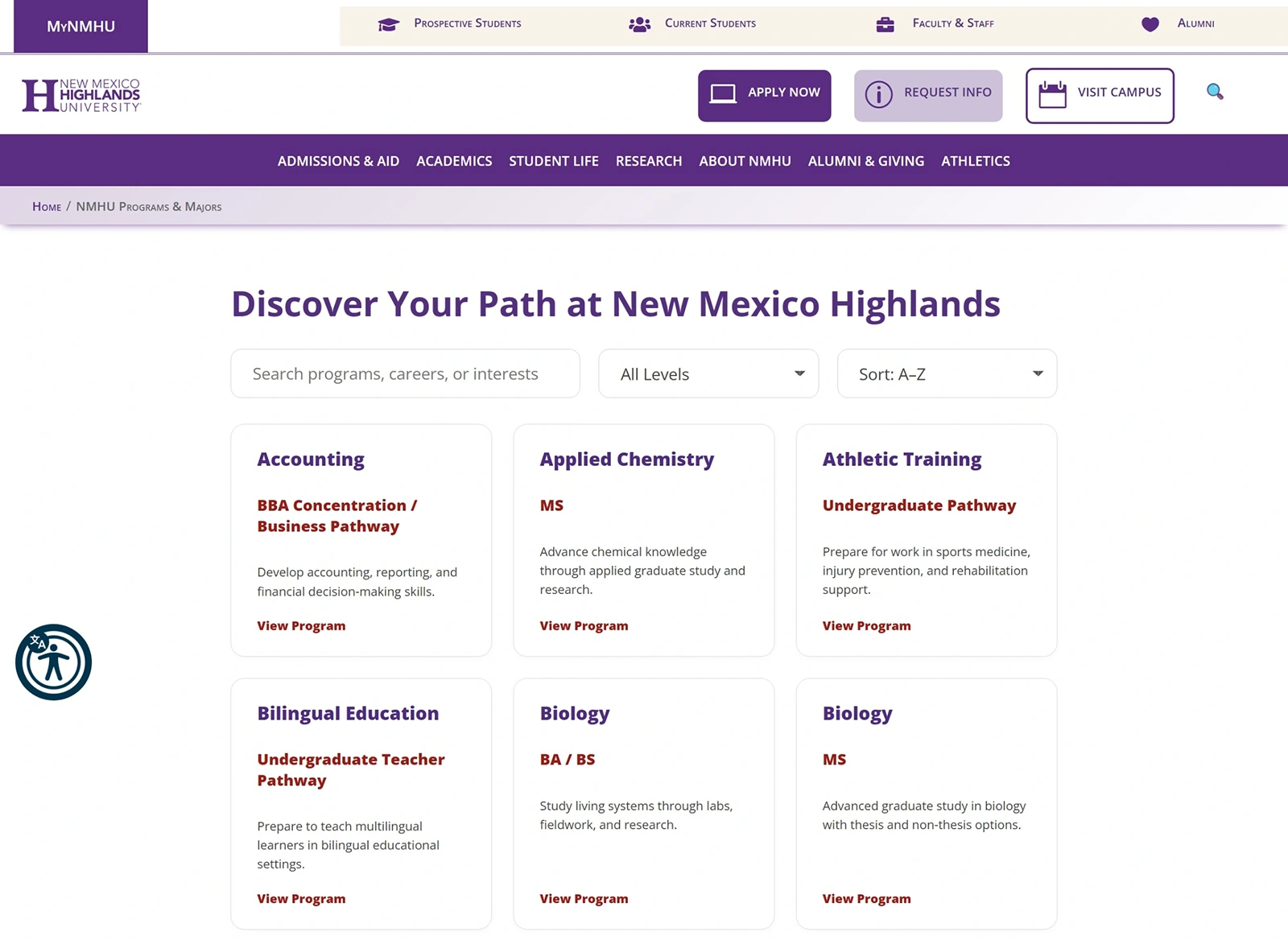
One of the most significant additions to the redesign was building a fully searchable Program Finder — a dedicated section where prospective students can search and filter across all 58+ undergraduate and 47 graduate programs by interest, career path, or keyword.
A compact version of the Program Finder was also embedded directly on the homepage, giving visitors immediate access to program discovery without requiring navigation.
This was built in WordPress with Divi, integrating with SearchStax to power the site-wide search experience with relevant, fast results.
Every department and program needed a consistent, scalable template that could carry both institutional branding and program-specific content. I designed and built templates for department landing pages, undergraduate programs, graduate programs, and degree pathways — each structured to surface the information prospective students need most.
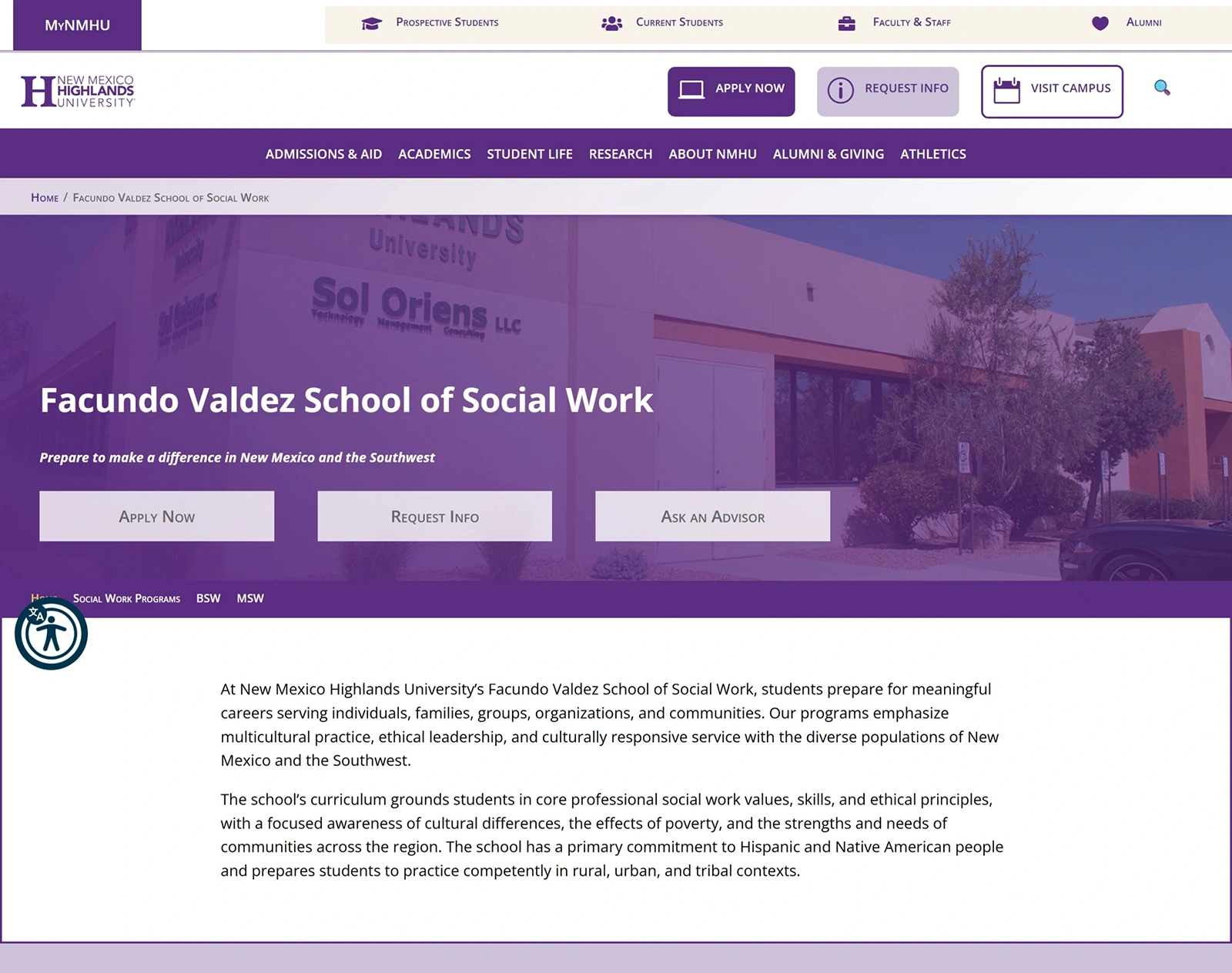
Department landing page — Facundo Valdez School of Social Work
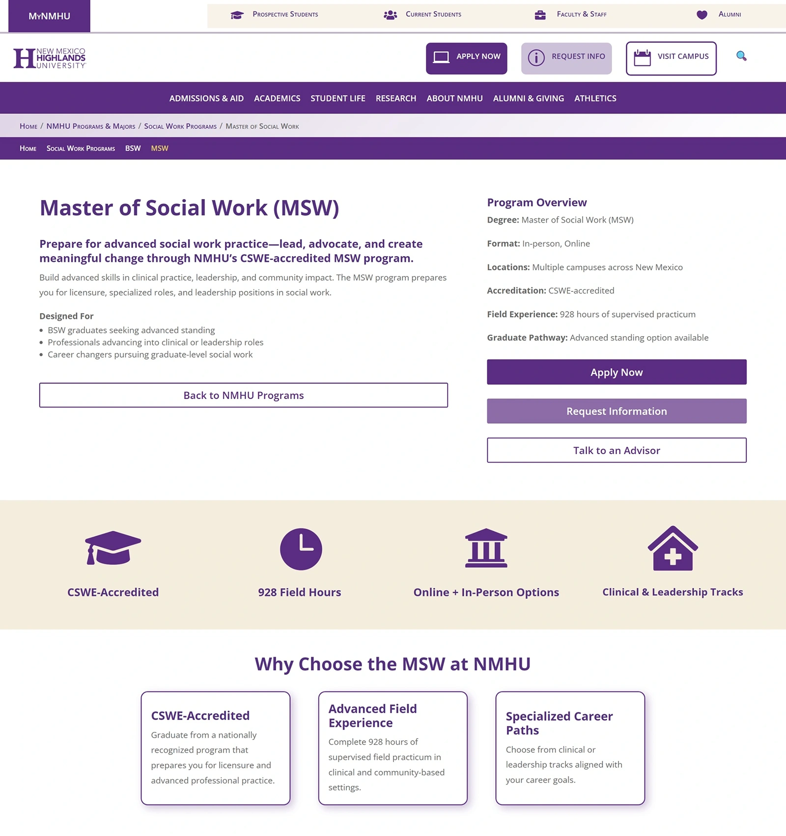
Program page — Master of Social Work
Eight months in, the redesign is active in development and being shared with departments and staff across the university. The new information architecture, global navigation, and core templates are in place. The Program Finder is live in the dev environment and being refined based on feedback.
Accessibility has been a priority throughout — the ReciteMe accessibility toolbar has been integrated to improve the experience for users with disabilities, reflecting NMHU's commitment to inclusive digital access.
View Dev Site →